Put your future career first. Pay tuition when you're hired.

Pay $0 in tuition until you're hired in a qualifying position

Live, personal mentorship from industry experts

6 months of professional career coaching

Get a job in tech or get your tuition back.
We’re invested in your future. That’s why, if you don’t get hired in a qualifying position within 6 months of graduating, you get a full tuition refund. Find our terms and conditions on the Tuition Refund Policy here.
Our Programs


$17k average
salary increase reported by Thinkful grads
81%
grads report being hired in 180 days
4.8/5
Career Karma rating
1-on-1 mentorship
How we work
Get matched with a personal mentor who works in the industry.

Live, personal mentorship from industry experts
Detailed feedback and reviews
In-depth career services

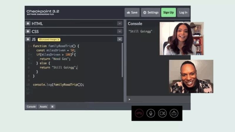
On-demand Technical Coaching
Connect with our expert educators in real-time with our live chat service. Ask questions and get feedback, fast.
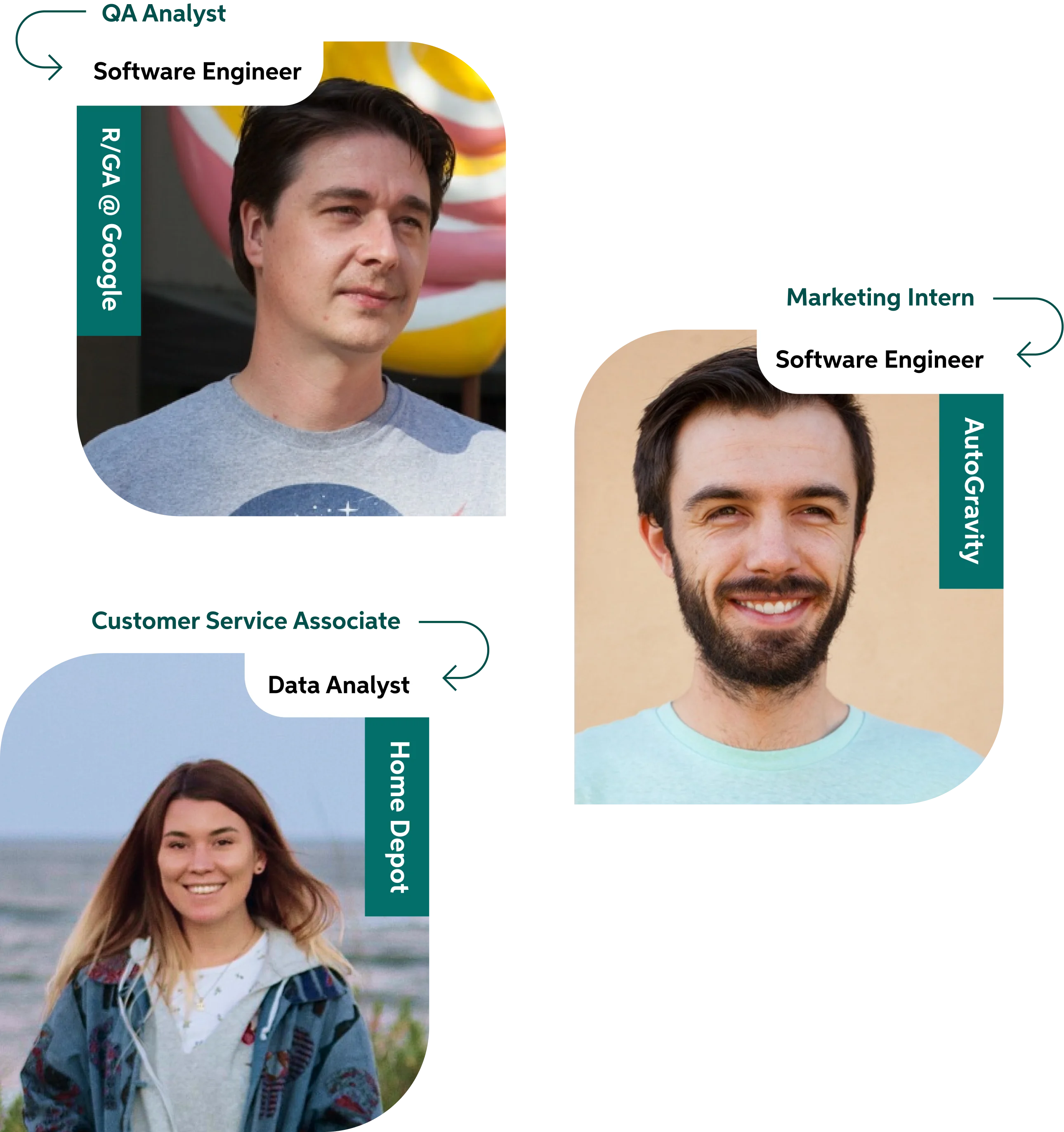
Big names hire Thinkful grads.

Student Outcomes
We help students launch careers.
Hired rate
81%
Average salary increase
$17K
Recent Job Offers

Our Admissions Team is here to help
We'll work one-on-one to answer your questions.


